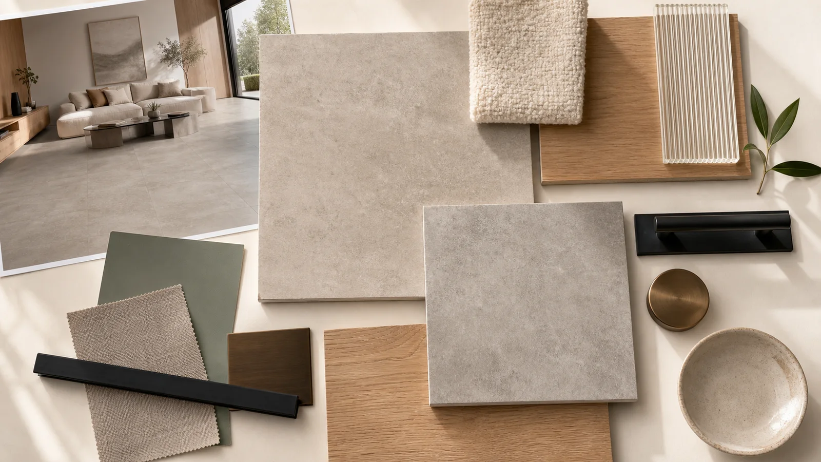
Concrete-look porcelain tile does not have to feel gray, cold, or unfinished. Its quiet surface can become a flexible background for wood, textiles, color, art, and everyday life.
Start with the Concrete Character
Not every concrete look tells the same story. Some tiles resemble smooth poured cement. Others show cloudy movement, trowel marks, aggregate, weathering, or subtle surface texture.
A quiet, low-contrast design supports minimal and continuous interiors. Stronger marks create a more expressive industrial or handcrafted mood. View several pieces together: a single sample cannot show the full pattern rhythm or repetition.
How to Make Concrete Look Warm
| Add | What it contributes |
|---|---|
| Oak or walnut | Natural grain and visual warmth |
| Linen, wool, or bouclé | Softness against a mineral-looking surface |
| Muted green or clay | Gentle color without overpowering the room |
| Matte black | Definition for frames, lighting, hardware, and furniture |
| Bronze or aged brass | A small warm highlight—best used with restraint |
| Ribbed or clear glass | Lightness and reflection beside heavier-looking materials |
The tile undertone should guide the palette. Beige and greige concrete looks sit naturally with warm woods and creams. Blue-gray surfaces often feel sharper beside black, cool white, smoked glass, and darker timber.
Use Scale and Layout Intentionally
Large formats reduce the number of grout lines and can create a broad, calm field. Medium formats make the tile rhythm more visible. Smaller formats and mosaics can introduce detail at showers, niches, backsplashes, or transition areas.
Choose grout based on the desired effect. A close color match lets the surface read more continuously; contrast turns the layout into part of the design. Joint width must still follow the actual tile, installation requirements, and applicable guidance.
Planning dimensions? Read How to Choose Tile Size and Format →
Room-by-Room Ideas
- Living room: use a warm greige floor with oak furniture, an ivory rug, and soft directional lighting.
- Kitchen: balance concrete-look flooring with wood cabinetry, warm white surfaces, or a restrained colored island.
- Bathroom: combine a quiet concrete field with one tactile accent—fluted tile, mosaic, ribbed glass, or timber-look cabinetry.
- Bedroom: keep concrete-look tile visually soft with a large rug, upholstered bed, layered curtains, and warm lamps.
- Commercial space: let the neutral base support signage, furniture, art, or brand color without competing for attention.
Build the Mood Board Before Choosing
Place the actual tile beside cabinet finishes, countertop samples, paint, metal, textiles, and glass. Review everything together in daylight and in the room’s evening lighting.
- Choose the concrete-look tile as the largest visual field.
- Add the dominant wood or cabinetry finish.
- Add one soft textile and one dark structural accent.
- Add color only after the warm and cool undertones agree.
- Photograph the board, then remove one element if it feels crowded.
Common Questions
Does concrete-look porcelain tile make a home feel cold?
Not necessarily. Warm undertones, wood, woven textiles, plants, layered lighting, and tactile finishes create a welcoming balance.
What colors work with concrete-look tile?
Warm whites, wood tones, muted green, clay, charcoal, black, and restrained bronze are useful starting points. Match them to the tile’s undertone.
What grout color should I choose?
A close match creates a quieter field; contrast emphasizes the tile grid. Confirm the grout and joint with the exact product and installer.
Is concrete-look tile only for industrial interiors?
No. It can support minimalist, Scandinavian, wabi-sabi, warm contemporary, urban, hospitality, or transitional rooms.
Should a concrete-look tile have visible variation?
Subtle tonal movement often makes it convincing. Review several pieces together to judge variation, repetition, and overall balance.