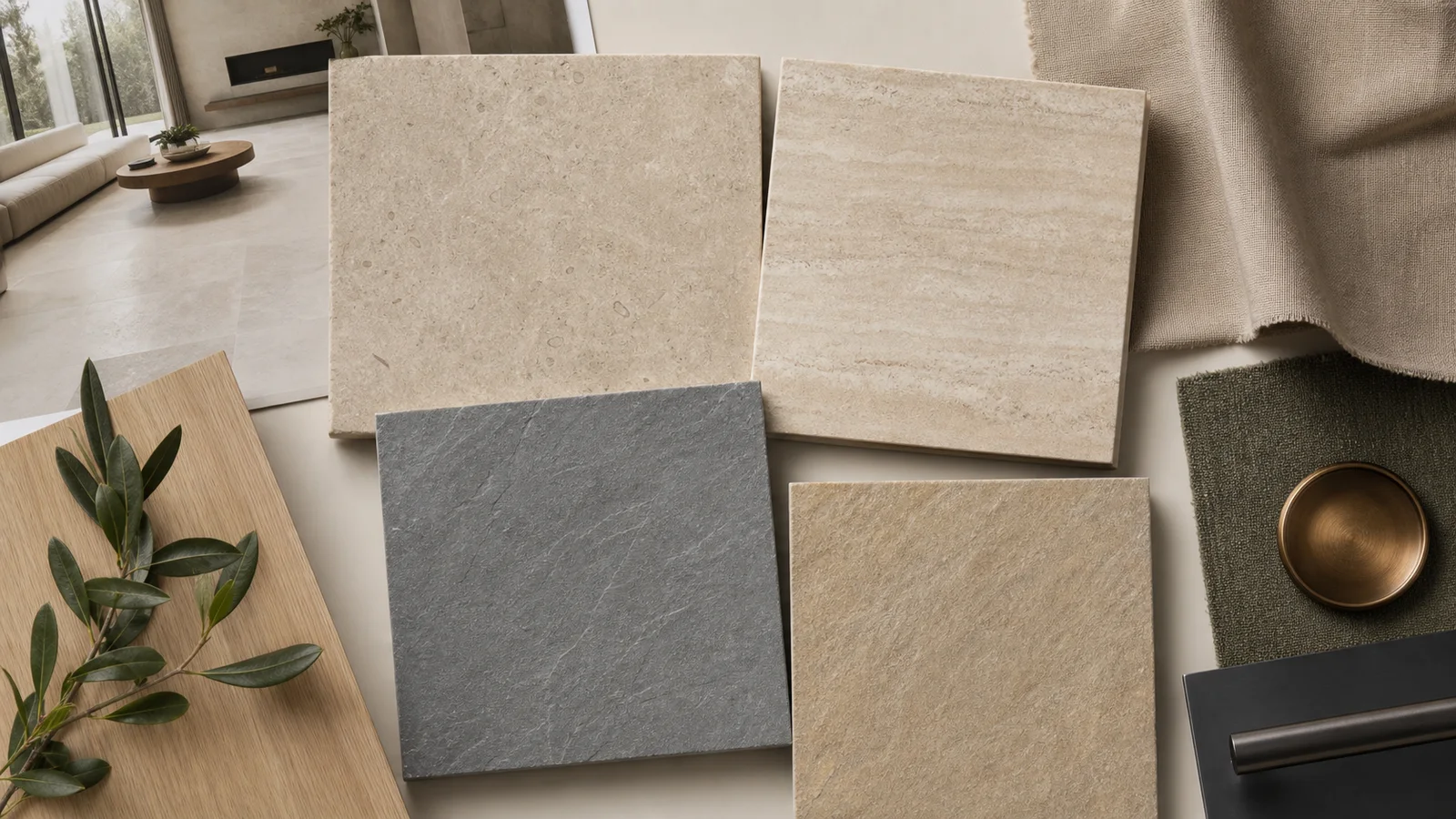
Stone-look porcelain can make a room feel grounded without making it heavy. The key is choosing the right mineral reference—quiet limestone, layered travertine, textured slate, sandy stone, or directional quartzite—and giving it room to breathe.
Five Stone Characters
| Look | Character | Works especially well with |
|---|---|---|
| Limestone | Soft, fine, low-contrast, sometimes fossil-like | Oak, linen, plaster, warm white, muted green |
| Travertine | Layered, linear, cloudy, warm and architectural | Walnut, bronze, cream textiles, ribbed glass |
| Slate | Darker mineral color and subtle cleft movement | Black metal, leather, pale wood, strong daylight |
| Sandstone | Earthy, granular, relaxed and informal | Clay colors, woven textures, natural timber |
| Quartzite inspired | Fine directional movement with greater energy | Simple cabinetry and restrained surrounding patterns |
Choose Quiet or Expressive
Low-contrast stone looks create a continuous background that lets furniture, art, and landscape views lead. Strong color movement or pronounced texture makes the floor or wall a more visible design element.
Before choosing, decide whether the surface should support the room or become its focal point. A small sample may look calm while multiple graphic faces create much more movement across a full floor.
Scale, Finish, and Texture
Large formats can create a broad architectural field with fewer joints. Medium formats make the modular rhythm more visible. Mosaics and dimensional pieces add detail at niches, showers, feature walls, or transitions.
Texture can add realism and shadow, but more texture is not always better. Consider cleaning, barefoot comfort, light reflection, and the exact application—not appearance alone.
Let Contrasting Materials Add Life
- Pair pale limestone looks with oak and linen for a calm residential interior.
- Use travertine looks with walnut and bronze for warmer mid-century character.
- Balance dark slate looks with pale wood, warm light, and softer textiles.
- Combine sandy stone looks with clay, olive, and handmade-looking accents.
- Keep surrounding patterns restrained when the stone graphic is already active.
Prefer visible grain and plank rhythm? Continue with Wood-Look Interiors →
Review the Full Mood Board
- Place several tile faces together—not only one sample.
- Compare the tile with cabinetry, wood, paint, metal, and textiles.
- Check the combination in daylight and evening light.
- Decide whether grout should disappear or define the format.
- Confirm finish and use for every location in the project.
Common Questions
What stone look is easiest to use throughout a home?
Quiet limestone and soft travertine references are often flexible because their low contrast allows other materials to lead.
Is stone-look porcelain the same as natural stone?
No. It is manufactured tile that reproduces a stone appearance. Its performance comes from the exact porcelain product.
Should it have visible variation?
Variation can add realism. Review several faces to understand color movement, distinctive marks, and repetition.
What grout color works best?
A close match creates calm continuity; contrast emphasizes the grid. Confirm the actual joint and grout with the product and installer.
Can it be used indoors and outdoors?
Some collections can, but the look does not establish suitability. Confirm finish, thickness, wet-use characteristics, climate, and approved application.