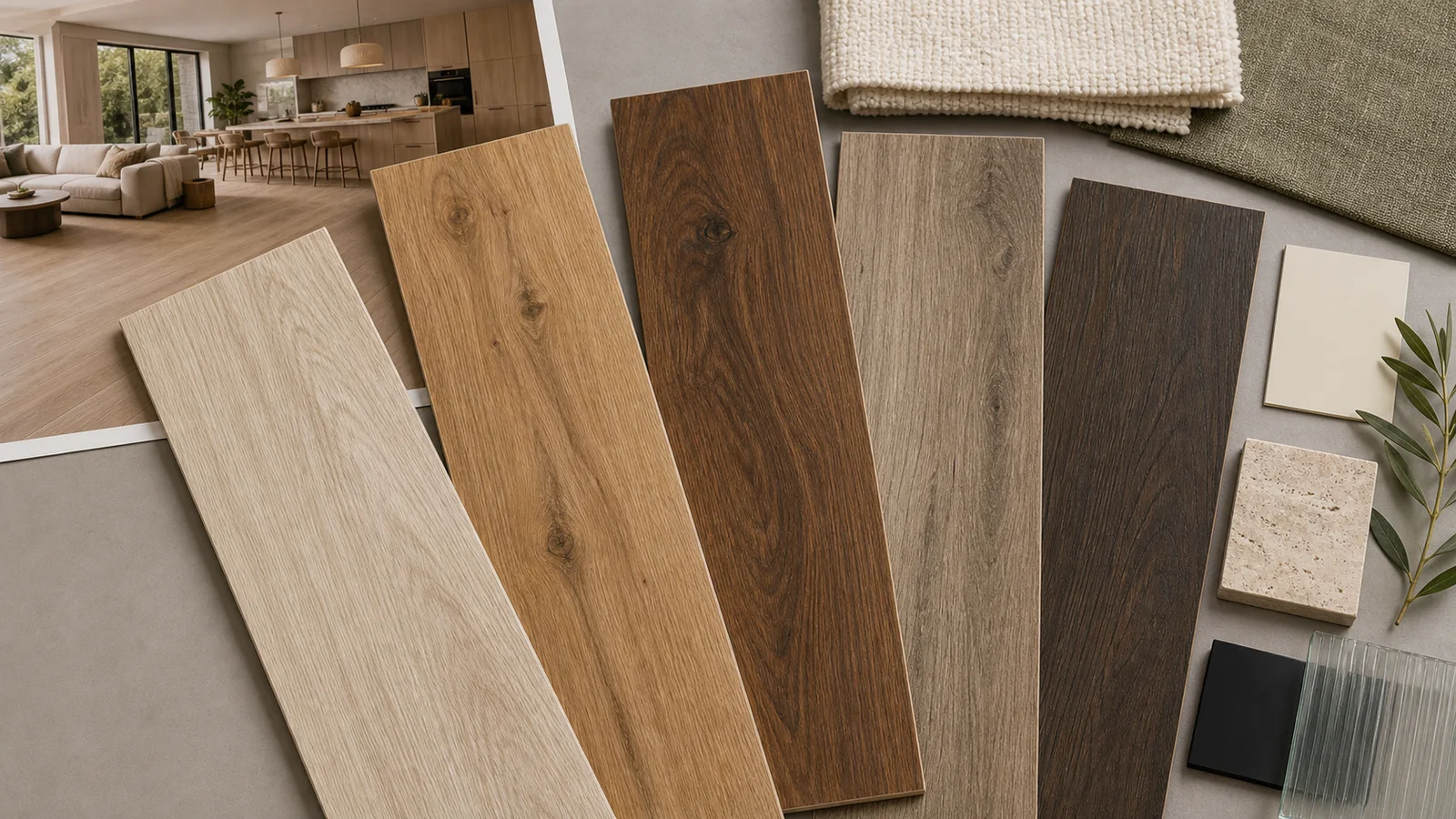
A convincing wood-look porcelain floor depends on more than choosing brown tile. Grain scale, knots, plank proportion, graphic variety, color movement, grout, and installation direction determine whether the finished room feels natural or repetitive.
Choose the Amount of Character
| Look | Visual character | Typical mood |
|---|---|---|
| Clean oak | Straight grain, few knots, low contrast | Minimal, Scandinavian, warm contemporary |
| Natural oak | Visible grain and moderate knots | Relaxed, versatile, residential |
| Walnut inspired | Deeper brown and flowing grain | Rich, tailored, intimate |
| Weathered wood | Taupe or gray color and aged markings | Coastal, rustic, casual |
| Smoked wood | Dark brown or charcoal with strong grain | Dramatic, modern, hospitality inspired |
Color Changes the Weight of the Room
Pale planks reflect more light and can make a continuous floor feel airy. Honey and natural oak tones add warmth without becoming too dark. Walnut and smoked colors create depth but need enough light, contrast, or pale furnishings to avoid visual heaviness.
If real wood cabinetry or furniture is already present, do not assume every wood tone must match. A deliberate difference in tone and grain often works better than two almost-matching woods.
Let Plank Direction Support the Architecture
Planks can follow the longest room dimension, the main circulation path, a strong sightline, or the connection between adjoining spaces. Running toward a window can emphasize light, but it is not a universal rule.
Herringbone, chevron, mixed-width, and other patterns add energy and usually increase cuts, planning, and material needs. Confirm that the exact format and installation requirements support the chosen pattern.
The Secret Is Graphic Variety
Wood-look porcelain repeats manufactured graphic faces. Collections with more faces can make repetition easier to distribute, but careful installation still matters. Open several cartons, mix the planks, and keep identical knots or distinctive marks apart.
Grout close to the dominant plank color usually creates a more continuous wood-like effect. The joint cannot simply disappear: its width must follow the actual tile, manufacturer guidance, and installation conditions.
Build a Balanced Mood Board
- Pair pale oak looks with cream textiles, sage, black accents, and limestone.
- Use honey oak looks with warm white, clay, bronze, and textured fabrics.
- Balance walnut looks with ivory, glass, pale stone, and restrained color.
- Give weathered taupe planks warmth through linen, tan leather, or natural wood.
- Keep other grain patterns quieter when the floor has strong knots and contrast.
Prefer mineral movement over visible grain? Compare Stone-Look Interiors →
Common Questions
Which color is most flexible?
Natural mid-light oak tones often work with many palettes, but room light and existing wood finishes should guide the choice.
How can I make the floor look more natural?
Review many faces, mix cartons, separate identical graphics, use an appropriate offset, and select a closely related grout color.
Should planks run toward the window?
That is one option, not a rule. Direction can follow the room length, circulation, sightline, light, or adjoining spaces.
Can I use a herringbone pattern?
Many formats can, but dimensions, squareness, cuts, waste, and installation requirements must support it.
Can wood-look porcelain be used in wet areas?
Some products can. Confirm the exact location, finish, slip characteristics, and installation system; appearance alone does not establish suitability.