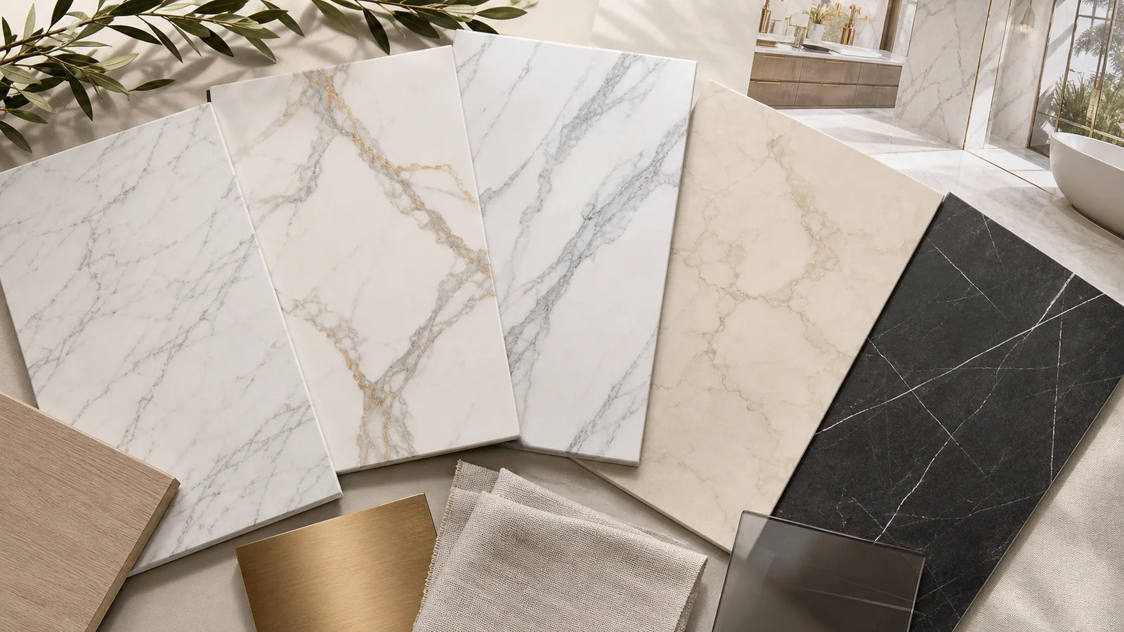
The vein is more than decoration—it gives marble-look porcelain its direction, scale, and personality. Soft movement can become a quiet background; one sweeping vein can become the room’s main architectural gesture.
Six Useful Ways to Read Veining
| Style | Visual character | Design effect |
|---|---|---|
| Fine and feathery | Many light, delicate gray lines | Quiet, flexible, and easy to use across larger areas |
| Linear and directional | Long veins moving mainly one way | Guides the eye and can visually lengthen a surface |
| Sweeping and bold | Fewer, wider veins with strong movement | Creates a focal point and a more luxurious statement |
| Branching | A main vein divides into smaller lines | Feels organic and animated without strict repetition |
| Cloudy or diffuse | Soft areas of color with less-defined boundaries | Produces a gentle, atmospheric surface |
| High-contrast dark | White or gold movement across charcoal or black | Dramatic and graphic; strongest when surrounding materials stay restrained |
Match Vein Scale to the Surface
Fine veining is visible at close range but can blend into a calm field from across the room. Large sweeping veins remain readable at a distance and often work best where enough surface is visible to complete the gesture.
On a small vanity wall, one bold vein may be the entire composition. Across an open floor, the same design becomes a rhythm of multiple tile faces. Neither is automatically better; the question is how much visual movement the room can comfortably support.
Vein Direction Changes the Room
Directional veins can lead toward a window, frame a vanity, rise vertically on a shower wall, or stretch along a corridor. Random rotation may create more natural variation, but it can also interrupt a deliberate flow.
Before installation, dry-lay several pieces and photograph different arrangements. Move highly recognizable faces away from one another if their repetition feels obvious. When a vein crosses a joint, decide whether continuity or contrast is the goal.
For proportion and layout basics, read How to Choose Tile Size and Format →
Bookmatch, Vein Match, and Continuous Graphics
A true bookmatch requires companion slab faces designed to mirror one another. When installed together, the veins open like a book and create a symmetrical composition.
Some collections instead offer continuous or “infinity” graphics intended to carry movement from one slab to the next. These effects are product-specific. They cannot be assumed from a regular marble-look tile, and they require a numbered layout plan before cutting or installation.
What to Review Before Choosing
- Background: bright white, warm ivory, gray, beige, green, brown, or black
- Vein color: cool gray, warm gray, beige, gold, rust, or white
- Contrast: quiet and blended or sharp and graphic
- Direction: random, diagonal, horizontal, vertical, or designed sequence
- Graphic variety: number of faces and how easily distinctive marks repeat
- Finish: polished for greater reflection or matte/satin for a softer reading
- Final composition: floor, full wall, shower, fireplace, backsplash, or single feature panel
Common Questions
What is the difference between Carrara-look and Calacatta-look porcelain?
Carrara-inspired designs often use finer gray movement. Calacatta-inspired designs commonly use a brighter background and fewer, bolder veins. Every collection interprets these references differently.
Does bold veining make a room look smaller?
Not automatically. Strong veins create movement and attention; the result depends on scale, contrast, lighting, layout, and the other patterns in the room.
What is bookmatching?
Bookmatching uses specifically designed companion slab faces to form a mirrored pattern. Confirm availability and plan the numbered layout before installation.
Should all veins run in the same direction?
Only when that supports the intended composition and product graphics. A dry layout helps compare directional flow with controlled rotation.
How do I check pattern repetition?
Review several faces, installed images, or manufacturer face information. Identify distinctive veins and see how often they repeat across the planned area.
Does polished tile show veins differently?
Yes. Reflection can intensify color and contrast. Matte and satin finishes usually read more softly. Choose the finish for both appearance and the intended application.